Discover
Audit the category before drawing anything. Find where it has settled into convention, and where it hasn't looked yet.
4 platforms audited · 12 personasI'm John Antony. I design operations software: dense, high-stakes interfaces where someone has to see what's wrong at a glance. Right now I own two B2B products end-to-end as a UX/UI design intern at Big Wings LLC.
Five stages I run on every project, each one backed by something I actually shipped.
Audit the category before drawing anything. Find where it has settled into convention, and where it hasn't looked yet.
4 platforms audited · 12 personasWrite down what a screen has to measure and why, then let the layout follow the argument, not the other way round.
KPI doc → the dashboard's 6-KPI rowSystem first, screens second. Colour, type and tokens are decided once, by role rather than hue, and reused everywhere.
Role-based palette · 30+ screensTest grey boxes before polish, so feedback is about how things work rather than how they look. Then let the data win.
Moderated study · SUS 85Hand off something engineering can map one-to-one, and keep the critique open after handoff instead of calling it done.
Semantic tokens · dev-ready FigmaDrag to explore
Two live B2B products and one research-led concept. Each opens into the full case study.
The operations console a repair shop runs its day on: intake, technician scheduling, capacity planning, work orders and invoicing. All 11 modules designed end-to-end, from competitive research to dev-ready screens.
→Read case study
The shop-floor companion to the portal: requests, workshop status, mechanics, inventory, payroll and earnings. Includes the two-tier Figma token architecture handed to engineering.
→Read case study
Onboarding: one promise, one action. The shop owner knows what the app is for before the first tap.

Dashboard: revenue, live counts, quick actions, and an AI suggestion the owner can accept or override.

Requests: incoming jobs with urgency, distance and age, with the urgent one always first.

Work orders: today's schedule on a timeline, with the mechanic and status for every job.
A gallery companion that explains artwork in plain language and lets teachers build and share collections. Full process: research, storyboards, lo-fi testing and a moderated usability study.
→Read case study
Welcome: a gallery-dark first screen that says what ArtLens is in one line.

Home: browse by movement or search, with scanning one tap away.

Artwork detail: plain-language context, with save-to-collection as the primary action.

Collections: named, shareable sets, cached automatically for patchy gallery Wi-Fi.

Share: the teacher flow. Add a note and send the collection to the class.
Turf booking app built around slot availability, so the next open slot stays in reach at every step.
Mobile · 2025Peer skill-exchange platform for desktop, built around browsing people rather than listings.
Desktop · 2025End-to-end mobile flow and component library for the carrier product. Onboarding copy rewritten; marked ready for dev.
Big Wings · 2026A 15-question, 4-section external questionnaire on transport management systems, delivered to leadership.
Big Wings · 2026I got into design by doing it obsessively until it started making sense.
BCA graduate from St. Joseph's, Bengaluru. At Big Wings LLC I learned that designing for people doing a job under time pressure is a different discipline from designing for people browsing at leisure. Denser, less forgiving, and far more interesting.
Big Wings LLC · US logistics tech · May 2026 to Present
Owning a B2B repair-shop portal and its mobile companion end-to-end, plus the main flows of the carrier app.
Dev-ready screens handed to engineering across two products.
Presented to the VP of Product and design lead every week, and acted on the critique, including the note that turned out to be a product bug.
Coursera · view credential ↗
--:-- in Bengaluru · open to remote & relocation
I'm looking for a product design role where the problems are operational and the data is dense. Always happy to talk one through, whether or not you're hiring.
Case study · Big Wings LLC · 2026
A B2B desktop portal and its shop-floor mobile companion. Competitive research, a 12-persona study, a role-based design system, and all eleven portal modules shipped to engineering.

Multi-bay repair shops run intake, technician assignment, parts and billing across disconnected tools: phone calls, whiteboards and spreadsheets. Nobody can see, at a glance, which jobs are slipping and which bays are free.
One operations console where a shop manager can take a request, assign the right technician to the right bay, track the job to invoice, and see schedule risk before it becomes a late delivery, with a mobile counterpart for the floor.
Built for the shop manager at a desk. Data-dense tables, planning grids and forecasting. It is the surface where decisions get made. Shops running multiple locations switch between them from a location picker in the sidebar.
Built for owners and mechanics in motion. Four core tabs (Dashboard, Requests, Workshop, Shop) plus payroll, earnings and inventory. Optimised for glanceable status, not deep analysis.
The product name is withheld and only a handful of screens are shown, with permission from Big Wings LLC. The rest of this page is the thinking behind them.
I audited four platforms in the fleet and shop-management space to find where the category had settled into convention, and where it hadn't looked.
| Platform | Strength | Gap I designed against |
|---|---|---|
| Fleetio | Strong asset and maintenance records | ✕ Bay-level, day-of scheduling visibility |
| Fullbay | Deep repair-order workflow | ✕ Forward-looking capacity and demand signals |
| Truckdown | Wide shop network coverage | ✕ Operational tooling for the shop itself |
| GPTransco | Dispatch and logistics coordination | ✕ Technician workload and performance view |
The brief that came out of this identified five capabilities with no direct competitor equivalent. They became the portal's differentiators: live bay intelligence, predictive parts pre-staging, service health scoring, demand forecasting, and margin intelligence with regional benchmarking.
The platform serves twelve distinct user types. I built a 14-slide persona deck covering all of them, reviewed with the VP and revised on his feedback around age ranges and role framing. Designing the portal meant knowing which three of the twelve live in it daily, and building for them without breaking the other nine.
Before designing the dashboard I wrote a KPI recommendation document for the VP, arguing which metrics a shop manager can act on within a shift versus which only matter at month-end. That document decided the six-KPI row. The layout followed the argument, not the other way round.
One palette, shared by the portal and the mobile app. The interesting part isn't the hex values. It's that a designer picks a colour by asking what the element is, not what it should look like.
Primary · Success · Danger & Warning · Base · Icons · Border · Surface · Font colours · Neutrals.
Each status colour ships as a set (a base, a dark variant for text and a faint variant for backgrounds), so a warning chip and warning body copy both stay legible without anyone inventing a value mid-file.
Dense tables need many closely spaced greys: row border, hover state, disabled label. Guessing at those in the moment is how a UI drifts, so they're enumerated once and reused.
Font colours are their own group, ordered by frequency, so the most common choice is the first one you reach.
Brand carries identity. Green, amber and red carry status. The two never overlap.
This is a product where colour has a job. A bay card that turns amber means a job is slipping; a red row means something needs a decision now. If the brand colour also meant something operational, every screen would argue with itself, and the one signal that has to survive a glance across a busy shop floor would be competing hardest for attention.
So violet appears in identity surfaces (the mobile hero header, brand moments, empty states) and is barred from anything that encodes state. It costs nothing visually and protects the part of the interface people make decisions on.
Plus Jakarta Sans across both products. It holds its shape at small sizes in dense tables, without the neutrality of a default system face. Phosphor icons at a single weight, so a toolbar never looks assembled from two sets.
Raw hex values, no modes, named color/[hue]/[scale]. Nothing in the file references these directly.
Named color/[category]/[role], aliasing to primitives. Components bind to semantic tokens only, so a palette change is one edit, not a hundred.
The separation costs a little setup time and buys the ability to rethink the palette without reopening a single component. It also gives engineering a token list that maps cleanly to their own variables.
Every module in the official user-flow spec is designed end-to-end: eight core operations (Dashboard, Requests, Work Orders, Team, Services, Inventory, Customers and Finance) plus three admin modules: Integrations, Compliance & KYB and Settings.
Dashboard: live bay intelligence, the KPI row, estimates, invoices and the AI copilot. The shift-opening screen.
Incoming requests: AI diagnostics, priority scoring and a recommended bay for every job in the queue.
Intake through to either a generated work order or a declined request. The rejection path is a first-class flow rather than a dead end. Declining a job sends the customer an SMS, so the reason screen includes a live preview of the message that will actually go out. The person choosing the reason sees what the customer will read.
The commercial spine of the product, from an accepted job to money owed. Parts search sits inside the job rather than in a separate inventory module, because that's where the mechanic is standing when they need it.
Capacity planning matches incoming request volume against available technician hours using workload rings and bay status. Performance covers efficiency trend, fault categories and certification expiry, because an expired certification is a scheduling constraint, not an HR footnote.
Bay heatmap, six-KPI row, revenue per bay, AI priority queue and predictive parts pre-staging.
Dense table with workload timeline bars, a right-hand detail panel and a team KPI bar. Scan first, drill down second.
Service health score, a 7-day demand forecast, and margin intelligence benchmarked regionally: three views no audited competitor offered.
Onboarding, four core tabs, and the supporting flows that keep a shop running: staff & payroll, earnings, inventory, managing and adding mechanics, shop profile and notifications.
Onboarding: one promise, one action. The shop owner knows what the app is for before the first tap.
Dashboard: revenue, live counts, quick actions, and an AI suggestion the owner can accept or override.
Requests: incoming jobs with urgency, distance and age, with the urgent one always first.
Work orders: today's schedule on a timeline, with the mechanic and status for every job.
The violet header appears only on tab landing screens. Every drill-down uses a plain white top bar.
Mobile products lose people in depth. Tap three levels down and you forget whether back returns you to a list or to the top. Making the header itself encode altitude means depth is legible before you read a word. No breadcrumb, no extra chrome.
A mechanic suggestion when assigning work, surfaced but never auto-applied.
A daily brief at the top of the shift, plus inline warnings on jobs at risk.
Insight chips that explain a movement rather than just charting it.
All three are assistive and none of them block a task. Each sits alongside the real data rather than replacing it, so a prediction is never mistaken for a recorded fact.
The problem: on the dashboard's bay cards, colour was doing two jobs: signalling schedule health and job state. A card could be amber because a job was late or because it was waiting on parts, and those call for completely different responses.
The decision: colour now encodes schedule health only: on time, at risk, overdue, not started. A separate pill carries job state: in progress, awaiting parts, queued. A text label sits beside the colour so the card never relies on hue alone. One glance gives urgency; a second gives the reason.
VP review of the Work Order flow returned two notes. The first was a UI problem. The second turned out not to be.
| Feedback | What was actually wrong | What I did |
|---|---|---|
| Status column | It conflated priority ("Critical") with workflow state ("In Progress"), two axes stacked in one column, so neither could be sorted or scanned reliably | Split into two independent indicators |
| "Waiting Parts" | It appeared as a status but didn't exist in the work-order state model. If a repair can be blocked on parts (and it can), that's a missing real state, not a label to delete | Raised it with the team as a product gap instead of quietly removing the chip |
The second note taught me the most. The fastest fix was deleting the status and moving on. Tracing it back to the state model meant the product got a real answer to a real operational condition instead of the interface quietly lying about one.
Multi-location shops needed a location switcher on both surfaces: sidebar on the portal, and brought into mobile so the mental model doesn't change between devices.
The portal's "Accept & share estimates" step was being brought into mobile, which jumped from request detail → accept → assign mechanic. Estimates shouldn't be a desktop-only privilege.
On the mobile Mechanics screen, the four stat cards and the filter tabs beneath them showed the same four values, so the same information appeared twice in two visual languages. My proposed fix: collapse the stats into the filters so a number and its filter are the same control.
Case study · Concept · 2026
An end-to-end UX project for a mobile gallery companion: research, personas, journey maps, competitive audit, storyboards, lo-fi testing, a design system, and a moderated usability study on the hi-fi prototype.
Gallery visitors walk up to artworks, read jargon-filled wall labels, and leave confused. There's no accessible, engaging way to understand art in context, especially for students and teachers who need to go deeper.
Let visitors instantly access plain-language context, let teachers build and share curated collections with students, and show design students how classical movements shaped modern visual design.
Can users find and understand artwork information quickly? Can teachers build, organise and share collections naturally? Where do users get stuck? Does the language feel accessible without an art background?
Moderated usability study on a Figma prototype. 5 participants, 4 tasks each, 30 to 40 minute sessions, in person in Bengaluru and remote over Google Meet. Screen-recorded with consent; SUS questionnaire after all tasks.
| Question | What we're measuring |
|---|---|
| Time to find + save | How long it takes to find an artwork, read context, and save it to a collection |
| Unguided navigation | Can users go from home to a completed saved collection without help? |
| First impression | Do users understand what the app does within 30 seconds? |
| Export clarity | Is Save + Export clear enough for a teacher to use independently? |
| Hesitation points | Where do users pause, go back, or express confusion? |
| Content accessibility | Does the detail screen inform without feeling like a textbook? |
Participants: 2 art-history professors and 3 design students in Bengaluru, all regular smartphone users, one using accessibility features. Incentive: ₹500 Amazon voucher.
"I want my students to feel something when they see a painting, not just memorise dates."Goals
"I know modern design owes a lot to classical art. I just can't figure out the connection easily."Goals
Curious but sceptical: "another badly designed museum app?"
🤔Understands the app within 20 seconds
🙂"This is exactly the language I want my students to read"
😍Bookmark icon instantly recognisable; toast lands well
😌Already planning next week's lesson around it
😄"Finally something that connects art to design"
👀Scrolling Bauhaus and Constructivism cards
🙂The section he didn't know he needed
🤩Wishes there was a personal notes field
😌It's become part of his workflow
🔁Three existing apps audited to find gaps: Google Arts & Culture, Bloomberg Connects and Smartify.
| Feature | Google A&C | Bloomberg | Smartify | ArtLens |
|---|---|---|---|---|
| Artwork scanning | Yes | Yes | Yes | Yes, as the primary action |
| Plain-language descriptions | Academic tone | Curator-heavy | Partial | Core focus |
| Teacher tools | None | None | None | Key differentiator |
| Collections | Favourites only | None | Basic lists | Named, shareable |
| Export / share | No export | No export | No export | PDF + share link |
| Art → design connection | None | None | None | Unique section |
Key insight: no existing app combines plain-language accessibility, teacher-specific tools, and a bridge between classical art and modern design.
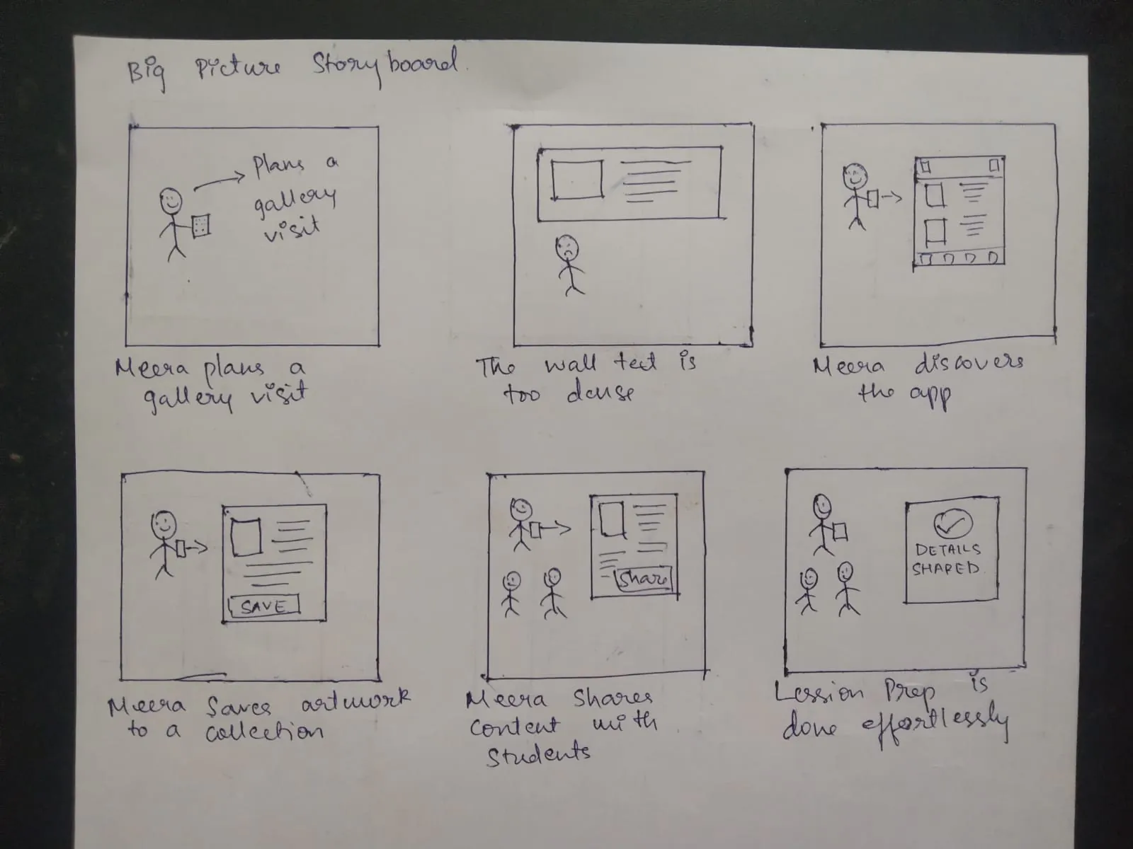
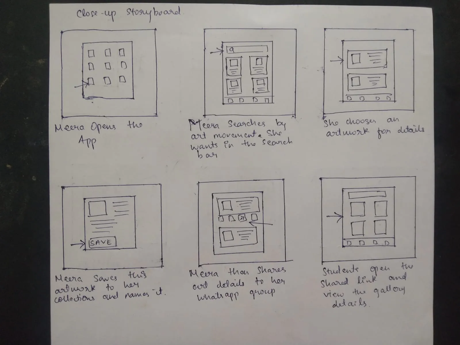
In the close-up storyboard, Meera finds an artwork by typing an art movement into search. That felt obvious when I drew it, because a teacher planning a lesson thinks in movements.
Testing said otherwise. Participants standing in front of a painting didn't reach for search at all; they looked for a way to point the phone at the artwork. Scanning wasn't a secondary convenience, it was the action people expected to be primary, and in the lo-fi round it wasn't prominent enough to find quickly.
So the hi-fi design promotes scanning to a floating action button on every main screen, while search stays available for planning away from the gallery. That gap between what I assumed and what five people actually did is the most useful thing this project taught me.
Grey boxes kept feedback on how things worked, not how they looked. That is what caught the save-button and scan-discoverability problems before either reached visual design.
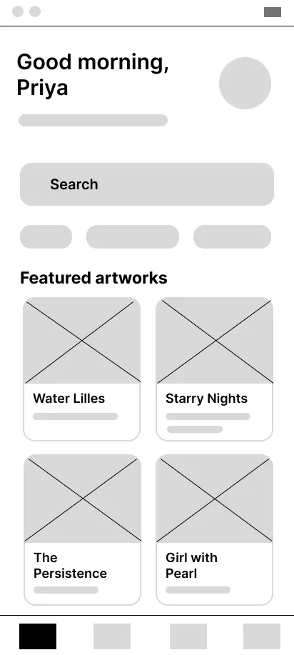
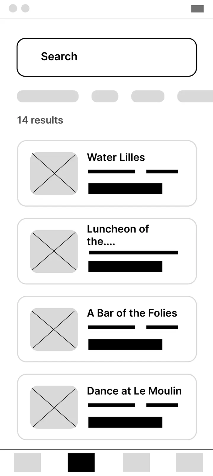
Warm parchment evokes gallery walls and aged paper. Terracotta brings energy without breaking the museum atmosphere.
Playfair brings editorial authority; DM Sans keeps body copy clean, like a well-designed magazine.
4px base unit across every screen, so layout stays consistent without deciding it each time.
WCAG AA contrast on all text, 44×44px minimum touch targets, designed with a large-text participant in mind.
Line icons at 1.5px stroke, with labels under every nav icon, because testing showed icon-only nav creates hesitation.
Visitor flow: scan → read → save. Teacher flow: collect → organise → export. The visitor flow opens on scan rather than search: the reverse of what the storyboard assumed, and the biggest single change testing produced.
Welcome: a gallery-dark first screen that says what ArtLens is in one line.
Home: browse by movement or search, with scanning one tap away.
Artwork detail: plain-language context, with save-to-collection as the primary action.
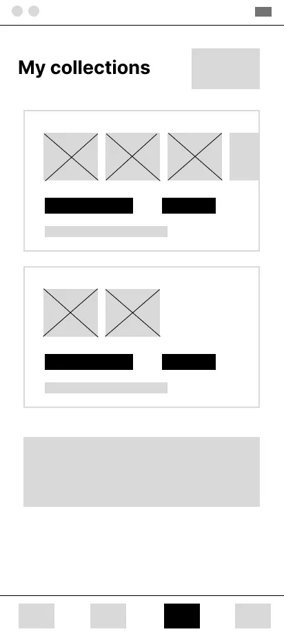
Collections: named, shareable sets, cached automatically for patchy gallery Wi-Fi.
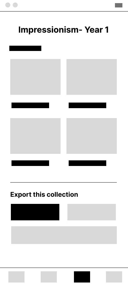
Share: the teacher flow. Add a note and send the collection to the class.
5 participants completed all 4 tasks without prompting. An average SUS of 85 sits well above the 68 benchmark, in the "excellent" range.
| Pattern | Insight | Design decision |
|---|---|---|
| Scan discoverability | Users expect scanning to be primary, but the storyboard assumed search-by-movement | Floating action button, always visible, terracotta |
| Save recognition | Bookmark universally understood; text buttons in headers are low-salience | Bookmark in the action bar with a "Saved!" toast |
| Export access | Export is the teacher's primary goal, so it shouldn't need hunting for | Export CTA promoted to the collection header |
| Content tone | All 5 found descriptions more readable than any gallery app they'd used | Plain-language approach kept as-is |
| Offline need | 2 users asked about offline because gallery Wi-Fi is unreliable | Saved artworks cached automatically, with an offline badge |